-
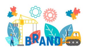
Rebranding doesn’t have to be a daunting task for your business. Even something as simple as a digital logo redesign can overhaul your company’s identity and completely reshape the impressions made on both your potential and existing customers.
It is important to recognize that as businesses continue to thrive and expand into online channels such as eCommerce, classic branding that may have worked effectively years ago communicates a more “tired” message to the modern consumer. Businesses with loyal or elderly audiences may benefit from this familiarity, but for those seeking to remain active and involved with younger target markets, a digital logo redesign is necessary for crafting a stronger brand identity.
Recently, many companies have found that adapting and updating their logo can better position their brand for present and future endeavors, such as expanding into new categories. The challenge digital branding for logo imprint imposes is that icons need to be able to stand alone to concisely represent a brand, whereas in the past logos had a luxury of space.
This remains especially true for social media platforms given the high degree of layout variance across different desktop and mobile sites. For instance, Instagram cuts off content that exceeds a certain size threshold. This means having a logo that is reasonably sized and easily replicable is crucial for consistent digital branding.
What’s in a great logo? Put simply, it has to illustrate the best parts of your business in a clear and concise manner. Impressions happen easily, but are just as easily forgotten if the brand fails to resonate with its intended audience early on and consistently into the future.
At Exults, we could write entire volumes about this subject, but a picture’s worth a thousand words when discussing visuals. With that in mind, here are five companies in recent years that each pulled off a digital logo redesign using unique approaches towards their rebrand:

Mozilla
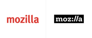
When organizations begin a rebranding process, they often keep development of new branding materials away from the public view, sometimes for over a year or even longer. Mozilla took the complete opposite approach when redesigning their logo, opting to share each stage of the development process with their audience in order to generate constructive feedback.
This resulted in one of the most strikingly creative logo redesigns a major company has undergone in recent years. Not only did this build public interest in the rebranding process itself, but it also emphasized Mozilla’s commitment to Internet services that prioritize user experience.
The Firefox provider cleverly working part of the hypertext transfer protocol secure element of a URL into its name (i.e. https://) helps it stand out among other technology companies. It also remains one of the rare modern logos that succeeds without the use of color.
Slack
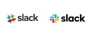
Slack’s original logo materialized before the launch of the company itself. While it illustrated the fun atmosphere the brand intended to bring to internal business communications, it also was incredibly difficult to reproduce across platforms. The hashtag/pound symbol used 11 different colors and required rotation at precisely 18 degrees to remain consistent with the original logo.
For a brand that prioritizes cohesion, this inability to apply consistency when implementing the logo elsewhere presented a big problem. To correct this, Slack adopted a logo with simpler colors, sharper text, and a more easily replicable symbol that still invoked familiarity with the original branding.
Now, rather than having to constantly adjust shades and angles when developing content and materials, Slack has an identity that brings excitement and simplicity to its potential audience and existing users.
Android

Making adjustments to a massive corporate brand never comes easily, but this is especially true when the consumer base consists of roughly 2.5 billion active devices around the world.
Last year, when Google opted to give Android’s branding a facelift for the first time in over half a decade, they sought to achieve many of the same goals as Slack did above. But how does a company improve on branding that has already worked so effectively for so many years in the modern era?
Seeking simple replication without sacrificing resonance, Google opted to keep the bugdroid mascot but stripped away its entire body in favor of retaining the head. Additionally, they updated the color pallet to a more distinctive tint of green while also making their name more legible by changing the font and color. With these two crucial elements now optimized for reproduction across multiple mediums, Google decided to make the “Android” name a permanent fixture alongside the logo, dramatically improving brand consistency.
Popeye’s
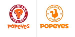
Popeyes had a wild end to 2019, sparking a chicken sandwich war in the fast food industry after their highly-anticipated offering sold out nationally within days. Entering 2020, the company had to drastically adjust to the sudden windfall of customers, and this included the need for a rebrand to keep up with the times.
Not much required change, but again, the need for easy replication while retaining familiarity was clear. As such, Popeye’s stripped their color palette down to one hue of orange, placed a chicken prominently in the center of their logo, and kept a similar font for their name while straightening it out for legibility purposes. In addition, they kept the “Louisiana Kitchen” phrase while removing the redundant fleur-de-lis in favor of the company’s founding year.
Popeye’s will likely claim one of the most successful digital logo redesigns of 2020. The company has clearly had no problems reproducing its new branding across online marketing or its packaging materials, as evidenced by the company’s rapidly rising same-store sales quarter over quarter.
Mall of America
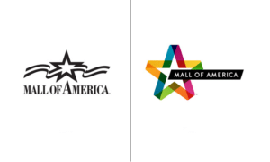
Mall of America’s rebrand represents perhaps the most dramatic change out of those on this list. At a glance, it stands in stark contrast to the one taken by Slack given the abundance of color in the current logo.
Though Mall of America’s previous identity above displays in black and white, it’s important to note that the traditional branding utilized a red, white and blue format consistent with the American flag. While this worked well in the early years of the mall’s inception during the ‘90s, it left the brand feeling tired by the time the mall hit its 20th anniversary.
As diversity became an increasingly important component of American culture during the 2010 decade, Mall of America sought to create a logo that represented this shift while retaining its distinct American identity. By retaining the star at the center but giving it a profound facelift with respect to color, Mall of America firmly illustrated its place as the intersection of “fashion, entertainment, cuisine, thrills, and community” to local Minnesotans and audiences across the United States.
Eight years later, it remains an extremely effective example of how prioritizing intricacy over simplicity can actually improve a company’s image.
What a Digital Logo Redesign Can Do for Your Company
What do all of these rebranding efforts have in common? They all sought to implicitly reposition the ways in which new and existing customers interact with a company’s brand. Though the approaches vary across industries, the goals remain the same, and the success remains consistent.
Whether subtle changes for replication purposes or dramatic transformations to completely overhaul identity, a digital logo redesign can positively reshape your company’s perception among your target audience. In doing so, you’ll ensure that your branding remains both consistent and dynamic for keeping up with the ever-changing trends of the modern business world.
At Exults, we already offer effective digital marketing solutions ranging from web design to social media management, and so our understanding of what goes into great digital branding comes built-in. Rest assured that as an agency with a full suite of Internet marketing services, we can help you craft a new brand identity that thrives across the digital landscape.
If you’re interested in seeing what Exults can do for your company and its brand, give us a call at 866-999-4736 or request a quote today.